


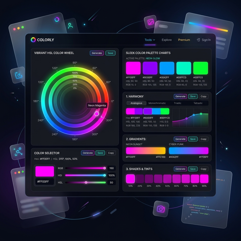
In the digital space, first impressions are formed in less than a second. While typography, layout, and loading speeds play vital roles, color is the single most powerful visual cue that shapes how users perceive a brand and interact with a website. Understanding the psychology of color in web design is not just an artistic skill—it is a critical driver for user experience (UX) and conversion rate optimization (CRO).
Why Color Psychology Matters in Web Design
Colors evoke immediate emotional and psychological responses. By aligning your website’s color palette with your brand identity and your target audience’s expectations, you can subconsciously guide user behavior, increase readability, and build trust. Here is how key colors influence user decisions:
- Blue (Trust & Professionalism): Widely used by financial institutions, tech companies (like IBM and Facebook), and healthcare websites. It represents stability, reliability, and security.
- Orange & Red (Energy & Action): Highly stimulating colors that create a sense of urgency. Orange is perfect for Call-to-Action (CTA) buttons (like Amazon’s “Add to Cart”), while red is ideal for sales and warnings.
- Green (Growth & Health): Green represents nature, tranquility, and financial success. It is highly effective for eco-friendly brands, health products, and organic services.
- Dark Slate & Black (Sophistication & Premium Quality): Used by luxury brands and modern creative agencies to show elegance, power, and minimalism. It is also excellent for eye-friendly dark modes.
Color Contrast and Web Accessibility (WCAG Guidelines)
While aesthetics are important, usability is paramount. A high-converting website must be accessible to everyone, including those with visual impairments. This is where contrast ratios become essential. Under the Web Content Accessibility Guidelines (WCAG 2.1), a minimum contrast ratio of 4.5:1 is required for normal text, and 3:1 for large text.
Using tools like a contrast checker ensures that your text stands out clearly against your background. Off-white text on a deep navy or slate background, for example, offers a stunning, premium aesthetic while keeping readability score extremely high.
Best Practices for Designing a Balanced Color Scheme
To create a design that looks professional and does not overwhelm the eyes, apply the 60-30-10 rule:
- 60% Dominant Color (Background): Usually a clean neutral tone (off-white or deep slate) that sets the primary atmosphere.
- 30% Secondary Color (Structure): Used for cards, sidebar borders, and headers to create depth and structure.
- 10% Accent Color (CTA): A highly contrasting, vibrant color reserved exclusively for buttons, active links, and highlights. This ensures your key actions immediately catch the user’s eye.
Conclusion
Great web design is where art meets science. By applying the psychology of color in web design, keeping contrast ratios high, and maintaining a balanced 60-30-10 palette, you can create a premium digital presence that is not only visually stunning but also converts casual visitors into loyal customers.